Mobile app design process | Best approach in 2024
In case you didn’t know, consumers spend between three and five hours on the phone every day utilizing smartphone apps. Each year, people spend more than a whopping 100 billion hours just using e-commerce apps.
But with 8.93 million apps available globally in different marketplaces, your app won’t stand out to win any screen time if it doesn’t have a great design.
To your luck, we’re going to discuss in this article the best approach for the Mobile app design process in 2023. The central focus is to build an app that provides a stunning User Interface (UI) and exceptional User Experience (UX).
If you don’t know what UI and UX mean in the mobile app design process, keep reading. If you’re already aware of these terms and would like to skip to the main process, click here.
What is UI design?
The user Interface (UI) is the contact point of interaction between humans and computers. Simply put, it’s the elements of technology that users interact with, such as display, sounds, the general style of the app, and its responsiveness.
So when we talk about the user interface design process, it includes the designing of the visual blueprint, including:
- Graphic elements
- Screen layout
- Animations
- Content
The user interface design steps involve tailoring the final product to the preferences of the target audience. The goal of any well-designed basic UI design is to facilitate quick and effortless action on the part of the user. The quality of the product’s user interface determines its level of success.
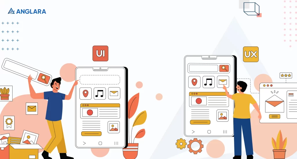
While UI focuses on how the app looks, UX focuses on how it feels and functions. Let’s understand what it means to UX design.
What is UX design?
User experience design (UX design) is an approach to the design of an app with the goal of improving the user’s experience in some way.
It is a user-centred design approach to create experiences that are meaningful and relevant. This is done by ensuring that design teams decide according to user requirements rather than preconceptions.
There are several parts of the bigger picture in the UX design approach, which encompasses the complete journey from discovering a product to using it in everyday life, including:
- Branding,
- Visual design,
- Usability,
- And functionality
The cornerstone of UX design is empathic consideration. UX designers need to be aware of the goals of the end-user and the difficulties they may face when interacting with the software. Many times the look of an app or website can overpower the feel, compromising the UX. This could become a reason why you may not get enough traffic.
If you have a website, read our article 10 Things That Increase Bad UX for Websites to see if any of these issues hamper your user’s experience.
Now that you’ve understood two main components of the mobile app design process, let’s get to the main part- the best approach to follow in 2023!
Best approach to mobile app design
Step by step UI design and UX design approaches in the mobile application design process vary based on designers and their preferences. But here’s an approach that experts at Anglara have refined over the years to provide maximum efficiency:
Research

Regardless of who you’re working with for the designs of your mobile app, research is always one of the initial and the most important step in this process.
Conducting thorough research will help determine competition, target audience, and user trends. This will further help you plan what you should offer in the app to stand out and how designers can inculcate it in the design. Here are three things research should include:
Competitor analysis
A competitor analysis will include listing the direct and indirect competitors of the app you’re designing. You’ll need to dissect what they offer and figure out the following:
- Their individual strengths
- Their weakness
- Gaps in the offering
This should help you understand what you need to offer to fill those gaps and rise over their weakness to stand out from the crowd.
User behaviour psychology
Ux design explained how empathy is the key to a top-notch mobile app design. For that, you need to understand the user’s behaviour psychology.
Designers will need to connect with your users to figure out how they will respond to your solution. This will help them understand their general attitude towards products or services you might be thinking of offering.
For this process, follow the steps below:
- Carry out interviews with people who qualify as your target audience
- Build a chart of what they say, what thoughts could run through their mind, how they act, and what they might feel in regard to your solution.
- Figure out their pain points and what problems customers have when using current products like yours.
- Make personas to better comprehend the consumers’ motivations, actions, and requirements before you start building the product or service.
Define problem statement
After a complete understanding of your competitor and target user base, you are in a place to define the problem your app will solve. The problem should include the gaps in the competitor analysis and your solution should cater to serve the pain points of users.
By defining the problem statement, you will ensure a focused mobile app design planning and ensure designers don’t run off the track.
Once you’ve acquired a clear understanding of all that we’ve mentioned above, you’re ready for the next step– Planning!
Planning
Planning is a crucial stage after research because designers organise the whole process in this step. In this stage, designers will determine the following:
- what kind of features you’ll offer and they’ll be accommodating in design
- tools and technologies that will be needed
- what your end product will look like
For efficient planning, designers need to design Information Architecture (IA). The goal of information architecture (IA) is to ensure that every given piece of data can be quickly and easily located and interpreted.
IA organizes, structures, and labels material efficiently for users to locate and execute tasks. In today’s mobile-first environment, IA is intricately intertwined with successful mobile navigation strategies and design principles.
Designers may provide applications with much-needed structure and aid users in accomplishing their goals by utilizing information architecture concepts.
There are two components to Information Architecture, namely the mobile app sitemap and user flows. Let’s understand them in detail:
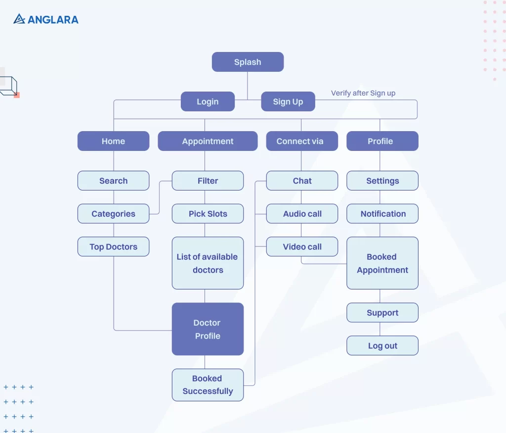
Mobile app sitemap
A visual mobile app sitemap provides IA, as the name suggests, in a very visual way. The purpose of this user-friendly sitemap is to depict the hierarchy of the app clearly. It’s a visual guide to the app’s information, features, and functionality for mobile devices. It helps developers craft an excellent UX by outlining the app’s overall layout and navigation.
In addition to creating a mobile app sitemap, designers also need to create user flow for a robust information architecture. Let’s help you understand that in detail.
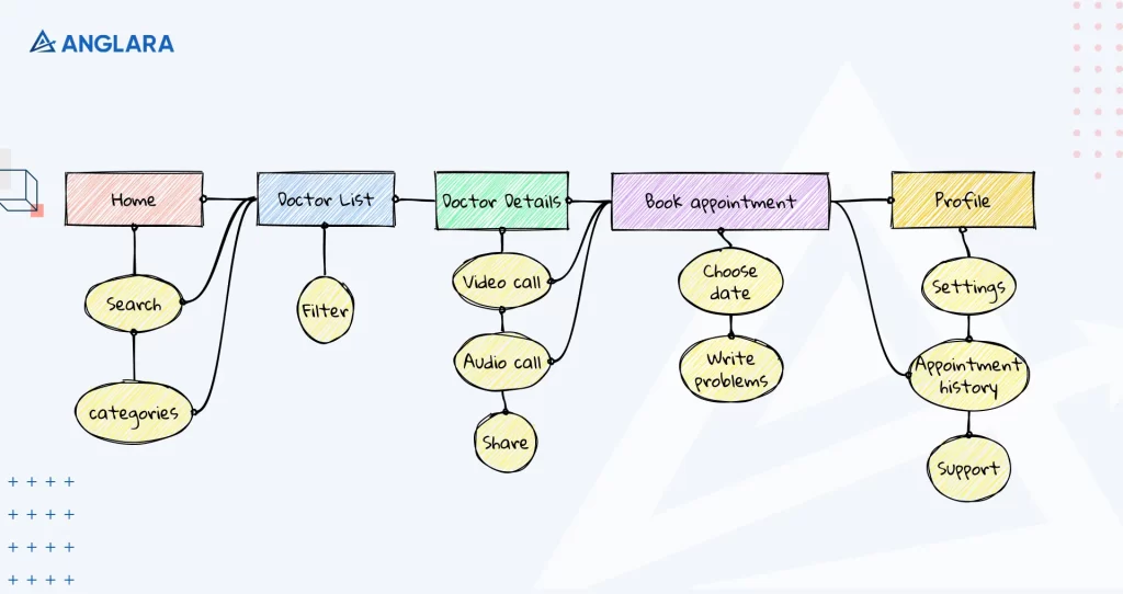
User flow
User flow, sometimes called customer journey maps, are diagrams that show how users move through your app from the point of first contact all the way to becoming committed brand advocates.
Designers will include detailed descriptions of the customer’s intentions, motives, and emotions at each stage of their experience with the mobile app. Below, you’ll our user flow of the medical app we mentioned above:
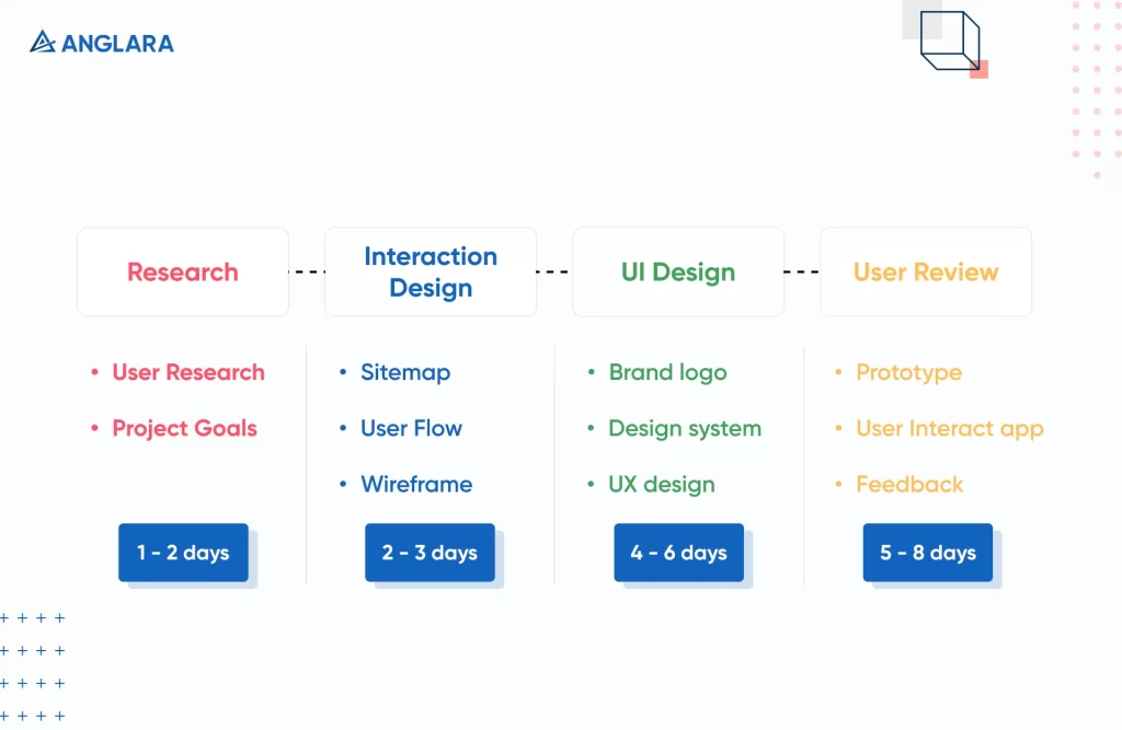
Timeline determination
When planning is done for the project, it’s important to lay out each step and estimate how much time it will take. Designers may plan their workflow down to the last detail and provide an estimated time to complete their portion of the job before the app development process can begin with the help of a timeline. Here’s an example of the timeline that experts at Anglara set for each project. Note that the timeframe can vary from module to module.
Once planning is done, designers will move on to some actual designing! Keep reading to see what the process includes!
Wireframe
The future app’s essential components are laid down as wireframes, which reflect the app’s framework. Wireframes lay the groundwork for the rest of the eventual app’s design. Wireframing is a three-stage process that forces us to focus on the foundation of the app:
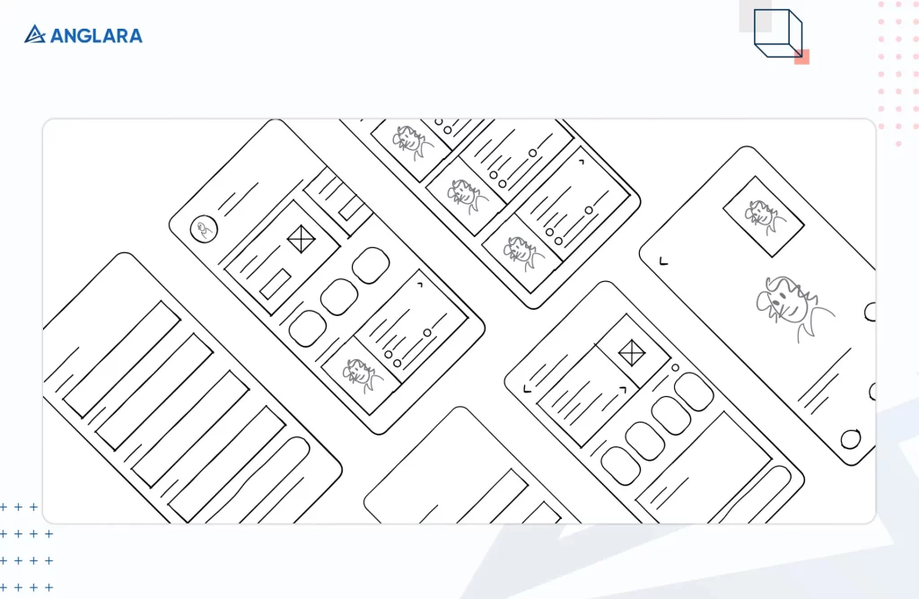
Low-fi wireframes
Low-fi (low fidelity) wireframes are like rough sketches of the design done with pen on paper. They are quickly created to give an idea of what the design would be like during a discussion. Here’s Anglara’s low-fi wireframe of the medical appointment setting app:
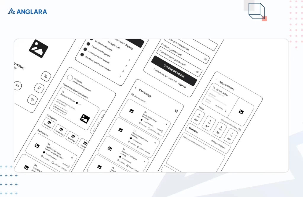
Mid-fi wireframes
Mid-fi (mid-fidelity) wireframes show more detail and realism when including the UI elements. However, if you don’t have time to complete each design process in full, you may just skip this stage. You can see that we’ve developed the low-fi wireframe into a mid-fi wireframe for the app:
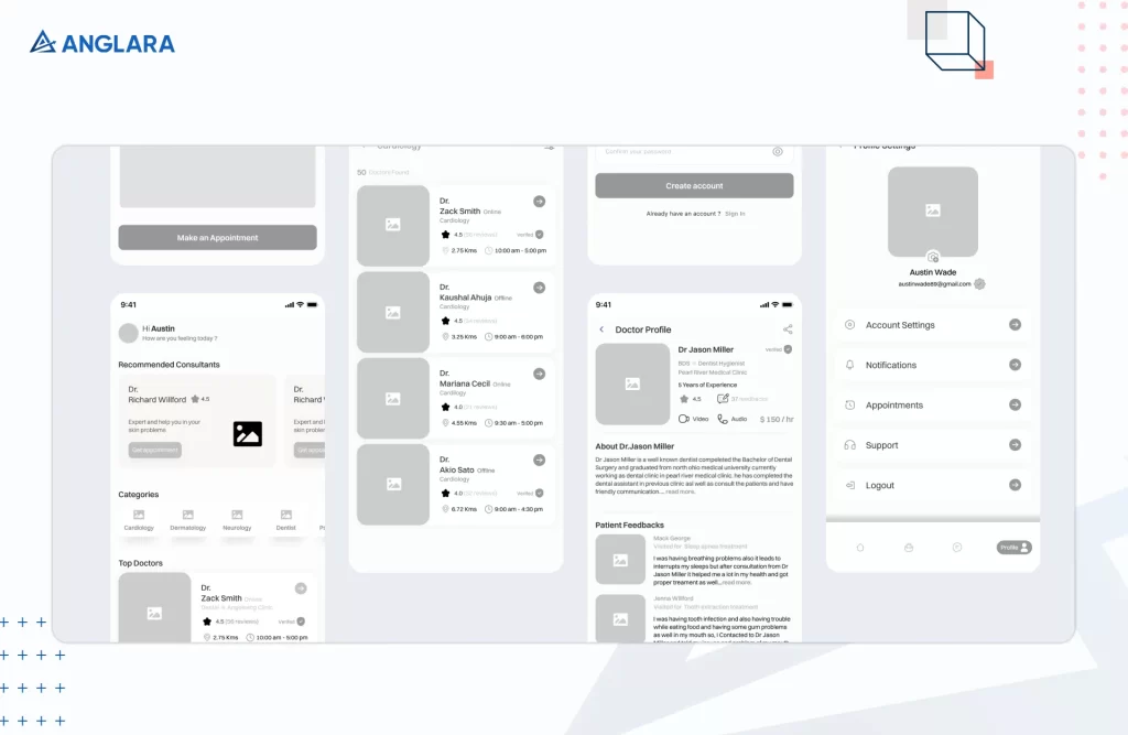
Hi-fi wireframes
Pixel-perfect layouts are a hallmark of high-fidelity wireframes. These wireframes will include the use of real images and text to represent a finished product. You can finally see that our Hi-fi wireframe comes close to the complete design of our medical appointment setting app:
Add design elements
Once the wireframe is ready, visual elements are added to the design. Here, designers may use pre-designed and bundled sets of visual elements to save time during the design and development of user interfaces: These could be anything, including:
- buttons,
- text fields,
- dropdown lists,
- toggles,
- and more
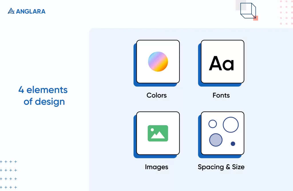
There are four key categories that make up your visual design language, and you should think about how each one functions in every part of the UI. These categories are:
Colour
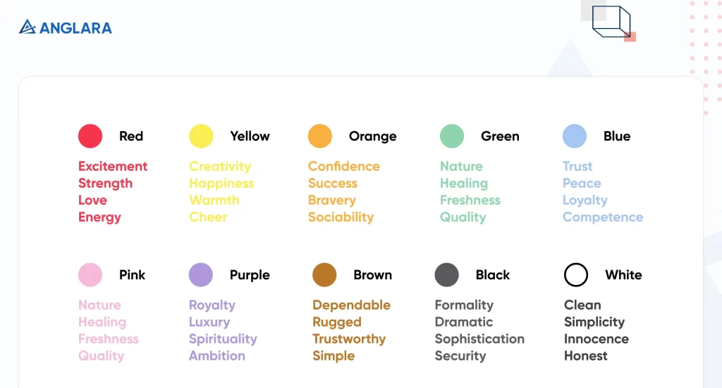
Since each colour invokes a specific emotion when viewed by the readers, it is important to choose your colour palette with care. The colours you choose will determine the tone of your brand and how visitors feel when they use your app.
Yes, you can be creative with colours at times, but if you want to follow the colour psychology, check out the infographic below.
Fonts and typography
When it comes to fonts, you want to make sure your written content not only looks good but is also readable. Usually, designers choose a standard font for all the written content that users will see on the screen.
While thin, light typefaces are in trend because they look clean and sleek, they’re not the best for readability. Choose your standard font’s weight, colour, and size keeping both in mind: its function and looks.
Visual elements
Visual material, such as videos, pictures, infographics, icons, etc may be quite effective in drawing visitors to your app. But you shouldn’t use them mindlessly. They need to be optimized and arranged in a way that they don’t compromise your app’s functions and also add to its appeal.
Make sure to use the appropriate size and image format too, and that your target OS can support it. We personally stick to using WebP format since it’s much smaller than JPEG and PNG, and yet the quality is uncompromised.
Spacing and size
The spacing and size method you choose will appear at its finest if it has flow and harmony. Because of its prevalence in industry standards (iOS, Android, ICO file formats, and browser default font size), a 4-based scale is becoming the go-to recommendation.
By the completion of this stage, designers have an app that looks very much real with all the design elements in place. While the app is not ready to use as there’s no code yet, but its exactly how your end users will see it. So what about the user journey? That’s part of our next section!
Prototyping
A prototype attempts to replicate the app’s design with features and functionality before the final code is written. They are used in user testing, where designers learn crucial information about the app’s usability. At this stage, app page designs evolve from detailed drawings. The main objective of a prototype in mobile app design is to create a mockup version of the app to present to the stakeholders.
After you’ve decided on your design elements, the designers will create a prototype with the final design to see the user journey on the app. This will include all the relevant content and branding components.
Below, you can witness the working prototype of the medical app our designers worked hard on:
This brings us to one of the final stages of the UI and UX design approach. Keep reading till the end!
User testing
After a prototype has been given the green light by stakeholders, it’s time to hear from actual users. User testing will verify the usefulness of your design and help you figure out any issues with UI or UX caused due to gaps in understanding of user behaviour psychology. For this reason, designers must test the design with various groups of users.
Getting individuals to participate in testing might be difficult at this level. Make use of every available channel to spread the word, be it:
- phone,
- email,
- in-person,
- or online networking sites
Getting the word out about your product early on is possible with consistent blogging and a robust social media presence.
Pass it on for development
Once you’ve got user feedback and made the necessary changes to the design, it is ready to be converted into an actual, launchable app.
First, the programmers will analyse the layout and provide feedback. Once they can begin working on it, programmers can then implement the UI/UX designers’ plans by creating the app’s back-end and front-end adding all the functionalities. They will develop a minimum viable product (MVP) before launching it to the public.
For the development process, developers choose their tech stack based on requirements. For cross-platform app development, check out our choice of 5 best cross-platform app development 2023.
Conclusion
There you have it, a perfect approach to the mobile app design process to follow in 2023. As we mentioned, every design team has their own approach; however, the team of experts at Anglara have vetted this process over 5 years of experience. With over 30 projects under our belt and a 90% client repetition ratio, we’re sure that this approach will work for you as greatly as it works for us.
If you’re looking for the right team to carry out the mobile app design process for you, we’d be more than happy to help. Building apps that provide a fantastic UI and UX is our expertise. Our professionals have worked with a wide range of businesses, so we know how to anticipate our customers’ demands and create digital products that meet their expectations. So no matter what your business is, we are sure we can build cutting-edge digital solutions for you in no time! Set up a free 30-minute consultation with us today to discuss the details of your next project!
Ready to discuss your next project?
Get a free 30-minute consultation with our experts to explore solutions tailored to your needs.


