

Wondering why your website isn’t able to generate much traffic despite your many marketing efforts? Are you offering unique products or great services with a spot-on price tag, yet you can’t seem to increase your conversion rate? Your website’s user experience (UX) might be an issue here.
Research shows that a bad user experience can drive away customers. After poor interaction with sites with bad UX, 88% of users claim they will never return. So if you want to bring in traffic, generate leads, and get more business, you must fix your website’s UX and make it a priority.
Most of the time, sites with bad UX are the result of compromising functionality and ease of use over how they look. So, even if your website is aesthetically appealing, it still might be failing you from a UX perspective.
To find out what may be hurting your website’s UX, continue reading about the ten most common and sneaky UX blunders that designers make.
What is UX?
User experience (UX), as the name explains, is the experience of the end-users of a website or an app. The UX of a website is the quality of all of the users' interactions, and it takes this into account:
- How they use the website itself
- If they were able to accomplish a desired task with it
From the user's point of view, the all the interactions with your website will count as the UX. It doesn’t matter whether certain components of it are directly controlled by the website or are only linked with it. Therefore, UX refers to the sum of all user interactions with your website.
Now you’re probably clear on what UX is. Let’s get to the part where we tell you about ten things that hamper the website’s UX.
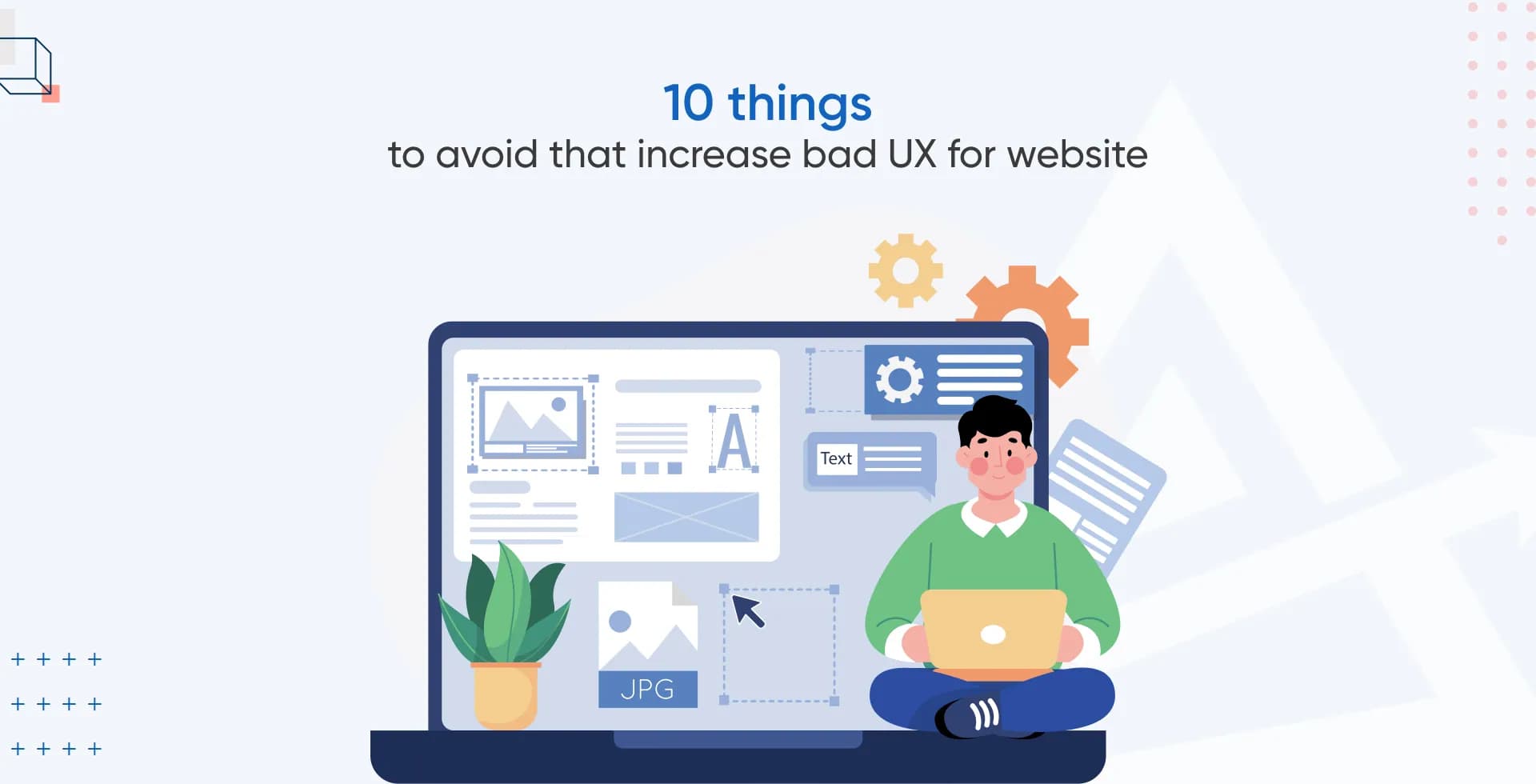
10 things that contribute to bad UX
Good user experience (UX) design prioritises usability above looks. A web designer's job is to improve the user's time on site, make it easier for users to complete desired actions, and boost conversions. But many times, they prioritise appearance above function, resort to hacks, and depend on outdated design trends.
Subpar UX is characterised by a lack of focus on the user's efficiency, aesthetic satisfaction, and control over the interface. Here's a list of ten common things sites with bad UX may have:
Slow website speed

Slow website speed
You've probably encountered websites that take forever to load. Like anyone else, we understand how frustrating this would be for you. The site's user experience suffers tremendously from slow website speed because, just like you, they’ll either wait grumpily for it to load or probably bounce right off.
Statistics show bounce rates increase as page load time increases. Let’s take a look:
- Google shows that if a page takes more than three seconds to load, the likelihood that the visitor will leave the site increases by 32%.
- Additionally, when graphics fail to load or require visitors to wait, 39% of users will stop interacting with the content altogether.
Your website doesn’t have to be a victim of slow loading speed. Whether you're cramming your site with photos or going crazy with your creativity, there are a lot of methods for speeding up your website. Consider hiring a page speed optimisation service that can take care of all the overly technical aspects of this issue.
Bad design
 Okay, we know we said functionality comes before aesthetics, but that doesn’t mean you compromise it.
Your website’s design plays an important role in the first impression that users get, and let us tell you, 94% of users will agree with this. Additionally, 74% of them will decide on your credibility based on how your website appears.
Keep in mind that a good design will definitely increase your sales. This is because the conversion rate suffers when the design is poorly thought out, out of date, or excessively innovative.
Innovative designs are a big challenge because they call for a high level of expertise, finesse, and a solid eye for detail. Therefore, as design experts, we suggest that if you are unsure about your concept, it is best to stick with more simple, slick, and straightforward designs.
A beautiful design doesn’t have to be complex. In fact, simplicity and minimalism might be the key here. The goals of good web design are:
- To encourage users to spend more time on your website
- Reduce the bounce rate
- Provide ease of use
We’ve realised that many times businesses put a lot of money into complicated designs, but users appreciate simple pages that:
- aren’t too bright
- well-organized
- and simple to use.
So remember, a basic, minimalist website powered by faultless UX is much better than a complex, hard-to-navigate one.
Bad navigation

Talking about navigation, the next point that hits the website's functionality and UX hard is bad navigation. Users who feel annoyed with the navigation are more likely to bounce from your website. They will think twice before returning in the future, keeping your website’s bad navigation in mind. Why? Because bad navigation is:
- inconvenient
- impairs the user’s intended path
- creates confusion
- disrupts the website layout
In our opinion, greeting users with an overwhelming navigation bar is a sure shot to damage their experience and send them scurrying from your site to your competitors.
User irritation may be greatly reduced by enhancing the UX with streamlined navigation that brings clarity to the user experience. What this means is that you should make it simple for them to locate the data they want.
Bad colour scheme

Since we are touching on the website’s appearance, let us point out how terrible colour schemes can mess up your website’s UX too. The right colours for your website can set the tone for your website.
Choosing themes with a neutral or soft colour scheme is your best bet if you want your visitors to feel calm and appealing. Some good examples include Apple’s black-and-white combination or Amazon’s black-and-white with yellow.
We also suggest that you make friends with white space. Leaving no white space in the design automatically makes your website cluttered and unpolished.
Did you know that you can choose colours specific to your business and industry and can be representative of certain emotions? For example:
- Red can signify excitement, strength, and energy
- Blue is a colour for peace, trust, and competence.
Check out the infographic below to see what other colours mean:

A crucial element of any UX design is the selection of a suitable colour scheme for the text and the backdrop because it affects how easily text can be read. The same is true for text over images, which brings us to the second most frequent UX gaffe: bad fonts/typography.
Bad fonts/typography

Numerous websites and applications have been choosing sleek, thin, and light typefaces. As screen technology develops and rendering gets better, more and more designers are turning to it because of:
- sophistication
- cleanliness
- current popularity.
However, these are exactly the bad fonts/typography that we’re going to talk about. Why? Because ever so often, they prove to be difficult to read. When choosing fonts for UX, two things are important, and these are:
- Fonts must be readable.
- They must be aesthetically pleasing.
So even when thin and light typography is popular for the second criterion, they dump the website’s UX because it doesn’t meet the first one. Designers shouldn’t mindlessly follow trends in such cases but find a sweet spot between size, weight, and colour to maximise contrast and readability.
Bad visuals

Images, videos, and other visual elements are literally one of the major engaging factors in your website’s content. But you don’t have to make use of them just for the sake of it. They must add to the visual appeal too!
We don’t think we need to tell you the importance of good visuals for good UX. But these factors are major contributors to bad visuals on a website:
- Low-quality pictures and videos: Dimly lit pictures and shaky videos are just unprofessional. If you want your website to be professional, these visual elements must not look like you got them from a kid. Use a good-quality camera and some easy-to-use editing tools to get high-quality images that fit the aesthetics of your website.
Disproportionate visuals: The website's graphics should all share a consistent style. You won’t believe how common it is for unprofessional websites to have cluttered web pages with too many pictures.
And what’s worse, they’re all different sizes! The disproportionate and varying sizes of images dispersed throughout the copy is a very common mistake, and we’re sure it will break your design and, in turn, the user experience.
- Stock images: How credible is it if you provide high-end products and services but only use stock images for your website? Remember that the images you choose for your website aren't just filler. They must be unique, relevant to the content, and emotionally engaging. Without these features, they are only cosmetic additions that have no bearing on the usability of the website.
Tip: Including stunning visuals on your website has been shown to increase UX. However, your website won't perform well if you use too many large photos, as they slow down the page load time. It is recommended that large photos be compressed before being uploaded to a website.
We often use images in WebP files as they are much smaller in size compared to JPEG and PNG, yet retain the picture quality.
Cluttered text structure

Even if the content is really informative and interesting, users won’t read it if it’s structured like an endless wall of text. People will even get frustrated if your website crams too much content onto one page in an unorganized and cluttered fashion.
The arrangement of the text is hardly a silver bullet for increasing sales. Still, doing so significantly boosts your chances of connecting with a larger percentage of the intended audience. Customers are attracted to a well-organised page with clearly labelled buttons and a logical layout. A well-structured content layout has specifics like:
- Headers
- Subheadings
- Lists
- Relevant graphics
- Other structural breaks
As you can see, we’ve used all these elements in this article itself!
Un-clickable buttons

Moving on from the visual appeal of the website, we get to a common functionality issue. Many websites employ buttons that are disabled until a certain input is provided. These are un-clickable buttons that activate when all the essential data is provided by the user.
The issue with un-clickable buttons occurs when something goes wrong and they become useless. Such buttons on website pages as CTAs become a significant source of frustration for the user. Because even when the information is correct, poor formatting may prevent them from clicking the CTA button.
"It’s not working" or "Am I doing something wrong?" often pop into the user’s mind. When you want your UX to be excellent, you go by the thumb rule: don’t make them think too much.
Un-clickable buttons for CTA require users to think about various ways to activate them. It's almost as if the system is teasing the user with a riddle for some sort of mind game!
So, how do we solve this? Provide clickable buttons that notify the user if any given information doesn’t fit the criteria. This way, they can provide necessary data without getting feeling of being stuck in the process.
Broken links

Say you’re searching for certain information on Google and a website pops up. You click the link, and guess what opens? A 404 error page. Bummer right?
Your site's visitors clearly care about the subject matter you cover, or else they wouldn't find themselves on your website. But if they accidentally click on a broken link, they too will get a 404 error page and are likely to exit the site without getting any valuable input. Thus, broken links heavily impede the user experience.
Additionally, if your website has broken links, it won’t just hamper conversions, it will even reduce traffic. This is because search engine crawlers are also not fond of dead and broken links. If a web crawler comes across a broken link, it will record the page as "empty" since it will not have any new information to provide. As a result, search engines like Google will rank your website lower in their results.
Only by maintaining a constant vigil with regular usability analysis can malfunctioning and broken links be identified and removed. You should also address any bugs in the code as soon as you find them
Unresponsive layout

The unresponsive website layout is the last but one of the very common functionality issues that put a damper on the website’s UX. Nobody enjoys zooming in and out to view a website on the phone, and we’re talking about more than 60% of internet users or five billion smartphone users.
Given these huge numbers, expert designers will never neglect optimising websites for phones; however, it's something that must always remain in consideration. Statistics show that 45% of internet consumers prefer content that can be viewed across all devices, so, if your website's design isn't adaptable to devices, only those using desktop computers will be able to view it.
Therefore, websites with unresponsive layouts will miss out on the great conversion potential that responsive layouts offer through:
- longer user sessions
- increased accessibility
- increased convenience
Unresponsive websites also go against Google’s ranking algorithm and affect SEO. Learn more about how to optimise your website content for good SEO.
Why is UX important?
A good UX is crucial since it is oriented toward satisfying the requirements of the end user. The goal is to create memorable interactions that make customers want to stick with your brand and stay on your website longer.
And trust us when we say it’s important to invest in a designer and website-development partner that can prioritise UX without compromising on the visuals. Because it enables you to create great consumer experiences that will ultimately support your commercial success. Even research shows that when you invest $1 in solid UX, you will receive $100 in return! That's a 9,900% return on investment!
Conclusion
Sites with bad UX can have a lasting impact on a business’s success. The common UX blunders we’ve provided are sneaky. These UX components often go unnoticed, sometimes even ignored on purpose, when the designers focus too much on how the website looks.
Whenever you hire a developer to create a new website or update the design of your old website, you must work with someone who can deliver top-notch UX and also a visually stunning interface.
By partnering with Anglara, you have access to a group of highly creative people that can anticipate consumer wants and requirements and develop innovative digital solutions accordingly. Our speciality is making websites that provide a fantastic user experience and a beautiful and functional interface.
We’d be more than happy to guide you through your next project through a 30-minute free consultation. Sign up here, and we’ll reach out to you to set an appointment.