

In our last article, we explained how bad website UX could affect the incoming traffic and its performance on search engine result pages (SERPs). We even listed 10 common things that increase bad UX for websites. This time, we thought we’d share a checklist for a website with good UX!
You must be wondering why are we so crazy about the topic of Website UX. Well, in addition to the price and other factors like security, one of the main factors that will influence your buyers to select a particular item or service over another is the superior user experience, that is UX!
In fact, 80% of users are prepared to spend more for a superior user experience. So, when you place more effort into perfecting your website’s UX, you’ll stand a chance to get 400% more conversions. This means a good Website UX will ultimately reflect in your bottom line.
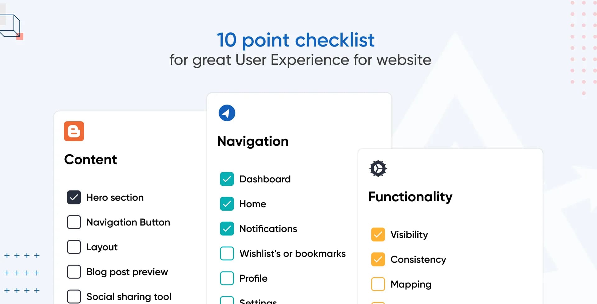
We think that you deserve to know about the elements we usually swear by for great UX. That’s why we’ve curated this checklist of a website with good UX, so you can check off one requirement after another that will ensure the great UX of your website! Let’s start with the functionality of the website.
No. 1 responsive website

Although over three-quarters of users would rather visit a mobile-friendly website, 96% of users report encountering websites that were obviously not made for mobile devices.
A functional website on all kinds of screens and devices is a major challenge and an excellent opportunity for businesses that want to connect with people through their mobile devices. For this reason, a responsive website is number one on our checklist for good website ux today!
A responsive website takes the approach to web creation that incorporates the viewer's device in terms of its screen size, operating system, and orientation to provide an optimal viewing experience.
So, first things first, make sure your website adapts to the size of the user's browser window, and make it accessible and operable from any device.
Since we’re on the topic of accessibility, let’s touch on the topic of accessibility to all types the internet users next.
No 2. check website accessibility

To ensure that your website is accessible to everyone, you should do regular accessibility tests. It's a good way to make if your website complies with World Wide Web Consortium (W2C) standards.
“Accessibility with the internet is the process of making websites usable by individuals with different abilities.”
There should be no doubt that there is a strong correlation between accessibility and website UX. Building an accessible website guarantees that everyone, regardless of their cognitive or physical abilities, has equal access to online material and communication tools provided by your company. So how will it help you? It will help your business in three ways:
- Strengthen brand image,
- Boosts your reputation,
- and makes you less vulnerable to legal action.
Web accessibility assessment may be made easier with the use of several evaluation tools. You can access the full list of tools and how to select one from W3C’s official web pages.
Now we move to the topic of navigation, which aids the functionality of the website and ensures that users can move from one page to another with ease.
No.3 easy-to-use navigation bar

The navigation bar in your website UX is crucial because it helps users find and access all of the significant sections on your website. You may call it the “roadmap” for your users to navigate through your website.
So for example, on an e-commerce website, you’re likely to see visible links to the shopping basket and checkout section on every page for easy access.
However, when you’re using a real map, wouldn’t it be overwhelming to see all the restaurants and hotels within a distance of five miles of your destination? It’s the same with a navigation bar.
Therefore, coming from experience, we think that when designing a navigation bar for a website with good UX, it is recommended to:
- keep it simple - not ornamental with complex design
- consistent on all pages - shouldn’t change its links or design across the website
- not cluttered - so keep only the important links
Since we’re talking about the navigation, let’s also talk about the homepage access and logo placement next.
No.4 logo placement
![]()
When a user clicks on some random links and moves away from what they were trying to find, they’ll get frustrated. They might quickly close the browser altogether if they can’t find a way back to the homepage.
To avoid this, ensure that there is a distinct and well-defined 'home' button available for users to easily navigate back to the beginning of the website. Most of the time, it is common for users to anticipate that clicking on your logo will redirect them to the home page. Therefore, a website with good UX needs to ensure that the logo functions as a link to the home page. But where should you place your logo?
When designing a website UX, it is important to prioritize the user's preferences. This means that even small elements like a logo can greatly affect how easy it is for users to navigate and use the site.
Us Designers know full well that logos that link to the homepage go on the page's left-top corner. And it should stay there, no matter what page the user is on!
If we don't do this, website visitors will have a hard time returning to the site's main page, making navigation a nightmare. And that's a terrible user experience design.
No.5 leave breadcrumbs
Do you know what you can do to nail your website’s navigation UX? Leave a trail of breadcrumbs! We’re not kidding, it’s a technical element in website UX. Breadcrumbs is a supplementary navigation mechanism used to show the user where they are on the site or app.
Websites with a lot of material typically include breadcrumbs that are structured hierarchically. Call them navigational aid that consists of a set of text links organized horizontally and delineated by the "greater than" sign (>). The sign denotes the page's level in relation to the links next to it.

We think that breadcrumb navigation is an excellent approach to help consumers navigate large websites with many pages. And guess what? Usability-wise, they serve two really important functions as they:
- cut down on the number of clicks a visitor must make to reach a page on a higher level, and
- make it easier to locate specific portions and pages inside a website.
No.6 clear CTA

Lingering on the topic of navigation for one last time, let’s cover Call to Action (CTA). A CTA is a button on the webpage that prompts the user to take action, such as "Buy now" or "Sign up." CTA specifies the next step for the user and reduces resistance as they go through the sales funnel. It is a crucial part of every website since it indicates to the visitor what they should do next.
How is it relevant in the UX, you ask? If there is no clear CTA, the user is less likely to take the targeted action. That is, they won't purchase or sign up, whatever you want them to do and are more likely to abandon the web page.
To nail the CTA game, use a CTA that:
- It is short and sweet
- Shows clear benefit
- Has actionable text
- Creates a sense of urgency
- Is placed properly to be visible
Now that we’ve covered navigation, let’s move to one of the most important parts of a website today for both-- visitors and search engines: the content.
No.7 easy-to-read content

Internet users are always looking for content that provides genuine insights and solutions to their problems. The primary goal of search engines is to index new and unique content continuously. But who even likes being greeted by a stark monochrome wall of text when they click a link?
To avoid such a horrendous experience on your website, it is crucial to format and structure textual content for ease of reading. And let's face the truth, no one will read all the entire articles and pages of text posted online.
People like to skim it in search of certain pieces of information. So take our advice– you want to ensure that your content is easily scannable. How do you do that? Keeping the following content structural things in mind:
- Keep paragraphs short
- Use short and direct sentences
- Divide the content with headings and subheadings
- Use bullet points and numbered lists like we’re doing here
- If one image can speak for thousand words, avoid those words and use an image
We don’t just preach, we do it too. Did you notice it as you read this article?
Easy reading and comprehension for your audience is the result of good readability. However, if your content is difficult to read, users may abandon it and bounce from your website. So make sure to keep these points in mind.
No.8 high-quality and relevant images

We told you to use a picture worth a thousand words instead of using words. But don’t make the mistake of taking our advice out of context. Because too many images or worse, irrelevant images, can also detract from the overall website UX! Here are a few things to keep in mind:
- Images should not be seen as a way to decorate your website.
- Too many images can cause clutter, slow down your website, and even confuse users.
- Grainy, blurred, or pixelated images are a strict NO!
- Images also need to be SEO-optimised.
- They need to be compressed or resized in a way that fits the layout on every device/screen.
To provide a good visual experience to your users, stick to using only relevant and high-quality images on your website.
No. 9 mind “above the fold” content

The content above the fold is what a user sees without having to scroll down the page. The term "below the fold" is used to describe any material that requires further scrolling.
Users focus primarily on the most prominent locations. Above the fold is prime real estate for websites, and therefore, it should feature the content that is most important for driving business objectives. The layout and placement of information are crucial, as it is the text that displays above the fold that is initially seen by the user.
To keep the visitor from leaving the site in search of anything else, the “above the fold” content must be compelling and grab the attention of the user immediately.
Do you know what’s annoying in the “above the fold”? Pop-ups! Let’s touch on that before we conclude, since using them smartly can greatly affect your conversion ratio!
No. 10 use popups smartly

When utilised properly, popups are a great method to attract prospective and existing customers to respond to your CTA. Yet a common error made by many websites is the excessive use of disruptive popups, which gives birth to the widespread misunderstanding that popups inherently ruin the website’s UX.
No one wants to see several popups, one after another, on a single page even if they are highly optimised or well-designed because they’re simply annoying. Additionally, too many pop-ups will impact your SEO too because as of 2018, Google has stated that it will penalize websites employing intrusive pop-up advertisements. To define it simply, intrusive pop-ups are all the pop-ups that are:
- spammy,
- and hurt the UX.
Here are some examples of popups that will hurt your website UX and demote your ranks on SERPs:
- Interrupting pop-ups that prevent them from reading the material,
- The ones that interrupt users in the middle of a task,
- Tricky page designs that make the content above the fold appear to be an advertisement.
To enhance your UX, we suggest using only one popup per session and focusing on that popup's intended purpose. In fact, we even suggest not using more than two popups for the entire session. Last, but not least, instead of using content-covering popups or above-the-fold popups, consider using:

- sidebar popups,
- floating bar popups,
- or full-screen popups that show after scrolling.
Before we conclude our checklist for a website with good UX, we’d like to leave you with a bonus tip.
Bonus tip
You know how quick support is an important part of website UX. Therefore, it’s important that users can contact you with ease when they need you. For this reason, you must place your contact information in a way that it’s easy to access. But you know what’s even better? Provide live chat support!

To provide higher-quality service to your website's visitors, live chat is increasingly being seen as part of a larger user experience (UX) strategy. Research suggests that live chat provides 73% satisfaction. That’s higher than email (61%) and phone (44%)!
Several considerations go into making your website's live chat as fast and convenient as possible, including:
- Prompt service for every customer.
- Design that’s eye-appeasing and functional.
- Ready-to-answer chat agents behind the scenes.
- A chat box CTA on every page.
We’re sure that by incorporating a live support feature, you’ll see great results in conversion and even decrease the bounce rate of unsatisfied users!
Conclusion
There you have it! A checklist of all the things you must include to create a website with good UX. When you combine these seemingly small changes we've listed above in the checklist, you'll notice that you can provide your users with a website UX that inspires trust, helps them feel connected to your brand, and fills them with joy and a sense of accomplishment.
In combination with our previous article 10 Things that increase bad UX for Websites, this article provides a complete picture of do’s and don’t’s when it comes to website designing.
At Anglara, we take pride in building websites with breathtaking designs with top-notch UX. When we’re the experts you put your trust in for your next project, you’ll witness that we neither compromise the look, nor the feel of your website. Our years of experience and satisfied clients can attest to it.
Set up a 30min free consultation with us today to discuss your next website design project to see what we can offer.